Archive for February, 2012

For an upcoming issue of Desktop Magazine, we will be revealing the Top 10 Australian logos, and the history behind each one.

To create the list, we are asking for your nominations, which will then be put against the nominations from our panel.

http://www.surveygizmo.com/s3/823364/Top-10-Australian-logos

Stefan Sagmeister – by ciAnnait

Posted: February 21, 2012 by kinnit in Uncategorized


“Style=fart”


This quote is possibly Stefan Sagmeisters most famous quote. Actually, it was a sign hanging inside his studio in 1993. It alluded to his conscious attempt to not get caught up in fashion statements, trend-spotting, or recreating what has gone before for the sake of some preconceived notion of style. He says “it was the headline of
 a theory that style and stylistic questions are just hot air
 and meaningless”. http://www.designboom.com/eng/interview/sagmeister.html


He has since removed the sign, and given up this theory stating that:

“I have learned that good (even trendy) style and form play an important role in delivering content to the viewer. But I never thought that graphic design has to be timeless. With very few exceptions I love the fact that design starts to look dated after a while.” http://www.aiga.org/stefan-sagmeister-style-fart-language/

Stefan Sagmeister is probably best known for his Album cover work. He has design covers for Lou Reed, David Byrne, Talking Heads – once in a lifetime, box set and, The Rolling Stones, amongst others. His work has been described as humorous, with a hand-made quality, and controversial, without being offensive. http://www.designboom.com/eng/interview/sagmeister.html


He says of his work: “For a long time we’ve tried to make design that’s somehow more personal, possibly more human-centered, more organic, more handmade, less objective, and moresubjective.”http://thecreatorsproject.com/creators/stefan-sagmeister


Originally from Austria, he graduated from the Vienna University of applied arts, with a first class degree, and a $1000 prize from the city of Vienna in 1985. In 1992 He moved to Hong Kong, and after some controversy at the advertising agency Leo Burnett, and tiring of the fast pace and high pressure of the large agency, went to New York to open his own studio.

http://designmuseum.org/design/stefan-sagmeister


He is currently working on a project “things I have learned in my life so far” inspired by the work of his grandfather. It is a series of typographic works, asking the question ‘how does the typography affect the transmission of the topic?’ http://www.sagmeister.com/node/343stefan sagmeister


Post 1; Kay: Ellen Lupton

Posted: February 21, 2012 by kaybeebaby1 in Uncategorized

Ellen Lupton was born in 1963, in Philadelphia, Pennsylvania. She is a graphic designer / designer, writer, curator, and educator.

Presently Ellen is curator of contemporary design at Cooper-Hewitt, National Design Museum in New York City and director of the Graphic Design MFA program at Maryland Institute College of Art (MICA) in Baltimore.

In the mid eighties after graduating from collage Ellen started off working at the Cooper Union Herb Lubalin Study Centre of Design and Typography. Here Ellen was able to combine her love for typography, design and writing.

In the late eighties Ellen and her partner J. Abbott Miller founded the Design and Writing Research Lab. The lab was a studio for fellow graphic designers / designers in which they were able to integrate theory and practice of design in a seamless kind.

Ellen bases most of her designs on typography. Regardless of the type of design some texts may have, text is everywhere. It is a medium and a message to the senders and receivers. Lupton bases much of her creation of type on The Bauhaus design techniques. (Bauhaus |ˈbouˌhous|
a school of design established by Walter Gropius in Weimar in 1919, best known for its designs of objects based on functionalism and simplicity.)


A major part of Ellen’s work as a Graphic Designer is to write and edit books about ‘Graphic Design’ as well as about ‘Typography’. Her books have a massive impact on how to combine design and text in order to communicate to the public!

bibliography:

  • Design your life: the pleasures & perils of everyday life (2009)
  • Graphic Design: the new basics (2008)
  • D.I.Y. design it yourself (2006)
  • Thinking with type: a critical guide for designers (2004)
Pictures:
  

References

http://elupton.com/
http://en.wikipedia.org/wiki/Ellen_Lupton
http://www.aiga.org/medalist-ellenlupton/
Oxford dictionary

Post 1 Kahra – Massimo Vignelli

Posted: February 20, 2012 by kahraokeefe in Uncategorized

Massimo Vignelli is one of the most Iconic designers of all time.

He is responsible for creating some of the most recognizable branding and logos since the modernist period.

Vignelli’s background is in architecture, which he studied in Milan, his birthplace, before moving to the USA and founding Vignelli Associates.


Vignelli associates’ portfolio includes designing anything from corporate identity, packaging design, designing for publications, furniture, products and interior design. Some of his most popular works include branding for American Airlines, IBM, Benetton and Sisley (“Colours of Benetton” campaign), signage for the New York subway, The Guggenheim NY, Packaging and signage for MOMA and many other leading American and European companies and institutions.

This branding is still current today


Vignelli said “We like Design to be forceful. We do not like limpy design. We like Design to be intellectually elegant – that means elegance of the mind, not one of manners, elegance that is the opposite of vulgarity. (Vignelli Canon 2008 p14)


His designs are clear and bold, using basic shapes and strong primary colours. He favours a toolkit of several classic fonts only. This structure assures his design aesthetic is always timeless and impacting.


He has strong environmental ethics, favouring specific paper sizes and supplies to ensure less wastage. He talks about this at length in the infamous Vignelli Canon p36 onwards. http://www.vignelli.com/news.html

An excerpt from Gary Hustwit’s indy film “Helvetica”. Massimo talks about the subway maps he designed and the pricipals he used to design them.http://www.helveticafilm.com/vignellimap.html


A personal interview talking about New York, designers, his life, his career and his famous take on the meaning of the word ‘vulgar’.http://observatory.designobserver.com/entry.html?entry=14398


I was really impressed with this designer from the get-go. The way he designs, the way he speaks, his personal life, and his humility. Although he exudes confidence, rightly so, there is no arrogance. He speaks from the heart in a matter of fact way, and knows his craft back to front. I would encourage anyone to study him, to read his ‘canon’, to watch his interviews. I am very excited about my discovery of him, and the knowledge and learning we can gain from this amazingly talented craftsman.
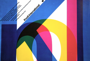
 

Knoll



Bloomingdale's Brand
New York Subway map

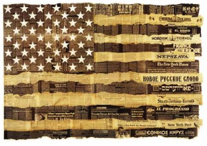
Bicentennial poster USA by vignelli associates, 1976


http://conceptgenius.com/massimo-vignelli-dicipline-design/

http://subtilitas.tumblr.com/post/712761444/massimo-vignelli-poster-for-knoll-international

http://www.forbes.com/2001/01/24/0124cc_print.html

POST 2: Logographic Design

Posted: February 20, 2012 by stacypollard in Uncategorized
A logo is a graphic mark or emblem commonly used by commercial enterprises, organizations and even individuals to aid and promote instant public recognition. Logos are either purely graphic (symbols/icons) or are composed of the name of the organization (a logotype or wordmark)
Every big corporation, every large bank and all the major events have something in common: a logo. You can’t do anything if you don’t have an identity so that’s why the logo designers are vital to every type of industry. Who are the most iconic logo designers in history, designers that marked the evolution of our society.
Make a post of  250 words with 5 relevant images and  5 links using selected designer and the more importantly the logos they designed . Use one of your existing designers or select another from the list below if your designer was not active in this area of graphic design. Inform teacher of your selection and changes. Discuss the logos – what they represent, use of colour, shape, symbol etc and how the visual identity has changed with the times.
Henry Steiner, Clemont Mok, Michael Wolff, Woody Pirtle, Adrian Frutiger, Robert Brownjohn, Peter Saville, Derek Birdsall, Irma Boom, Abram Games, Herb Lubalin, Armin Hofmann, Anton Stankowski, Lindon Leader. Yusaku Kamekura, Wally Olins, Gerard Huerta, . DUE 13.03.12

Paula Scher

Saul Bass

Alan Fletcher

http://www.youtube.com/watch?feature=player_embedded&v=N4t3-__3MA0
http://www.logoblog.org/wordpress/famous-logo-designers-creation/
http://www.logosdesigners.com/
http://www.topdesignmag.com/the-most-iconic-logo-designers-and-their-work-part-1/
http://www.logodesignsource.com/types.html

POST 1: C20th Century Designer

Posted: February 17, 2012 by stacypollard in Uncategorized

In class you were asked to select two graphic designers from a list of quotes on their approach to graphic design. Research one of your designers, gather information into a word document and collect numerous  images into a labelled folder and bookmark into folders. Summarise the most relevant information pertaining to their unique contribution to C20th graphic design with a post of 250 words, 5 relevant images and relevant links. DUE 06.03.12
http://www.sagmeister.com/
http://www.researchstudios.com/neville-brody/
http://www.lesterbeall.com/