Archive for May, 2012

Post 8 1920’s Vanity Fair: plaki

Posted: May 15, 2012 by paulalaki in Uncategorized

History made of Covers:

The Vanity Fair magazine has been around for lets face it decades and decades and well I think you get the picture… During the 1920’s the Vanity Fair magazine covers were highly Illustrative with influence from the art movement of that time including: Art Deco, Dada and Surrealism just to name a few. Now I’m going to post some covers from two artist A.H. Fish and William Bolin, who were very influenced by the Art Deco movement and I will talk a little about their individual style as well as why I liked them as artist.

April 1922 – A.H. Fish

I love these covers because the Illustration is made up of these beautiful simple lines that demonstrate very clearly the style of that decade and well as the comical elements to the art.
A.H Fish use color is very striking she isn’t afraid to be bold with color and she chooses wonderful texture to the color that don’t drown the rest of the Illustration.

A.H. Fish seems to manage to find the right balancce  between too little and too much. and with the strong shapes used I would have to say the art influence would be Art Deco.


September 1925 – William Bolin

He created magazine covers for both Vanity Fair and Vogue. His style is very Art Deco with the geometric shapes as well as the style of the women with long slender bodies and long legs with feet coming to a dainty point. He use of light and shadow in the art makes them very striking and makes the viewer hold with anticipated movement.


I will also add a few more covers from various different artists


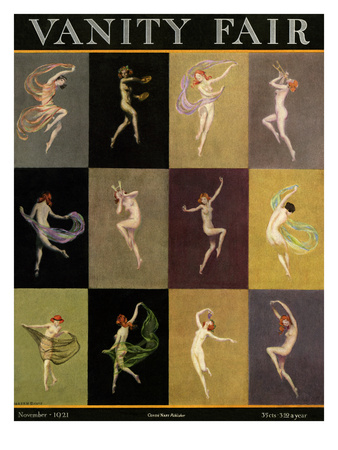
November 1921 – Warren Davis


May 1926 – Warren Davis


Bibliography:

http://thebluelantern.blogspot.com.au/2008/01/h-fish.html


http://www.oldmagazinearticles.com/old-vanity-fair-magazines.php


http://www.condenaststore.com/-sp/Vanity-Fair-Cover-February-1926-Prints_i8483291_.htm


http://www.condenaststore.com/-sp/Vanity-Fair-Cover-March-1928-Prints_i8483329_.htm


http://www.condenaststore.com/-sp/Vanity-Fair-Cover-June-1926-Prints_i8485848_.htm


The Saturday Evening Post is a bimonthly American magazine. It was published weekly under this title from 1897 until 1969, and quarterly and then bimonthly from 1971.

Each issue featured several original short stories and often included an installment of a serial appearing in successive issues. Most of the fiction was written for mainstream tastes by popular writers, but some literary writers were featured. The opening pages of stories featured paintings by the leading magazine illustrators, and it also featured Poetry.

I am going to cover Illustrator Norman Rockwell’s contributions to the magazine in this blog and talk about his creations.

Below are some of The Saturday Evening Post covers issued in the 1940’s and illustrated by Norman Rockwell.

This photo of Rockwell appeared in the Post in 1943. By this time, the man at the easel had been doingSaturday Evening Post covers for twenty-seven years. The forties were a time of humor, anguish, the workplace, and kids being kids. This week: 1940s classics.

“The Gossips” – March 5, 1948

A great illustration tells a story, and we all know this tale. Don’t you hate when someone starts a rumor about you? Well, it happened to Rockwell and he didn’t like it one bit. But he had a weapon: a paintbrush and a platform viewed by millions: The Saturday Evening Post cover spot.

It’s fun to look at the expressions: some appalled, some relishing the scandal. Afraid he might offend his neighbors/models (love the lady in curlers and the guy in the bowler hat), Rockwell included his wife and himself among the rumor spreaders. Mary Rockwell is second and third in the middle row and Norman is at the end, first with a “Who? ME?!” expression, then giving what-for to the lady who started it all.

“Rosie the Riveter” – May 29, 1943

With the men fighting the war, women had to step up to the plate and keep factories, farms and offices going at home and this gal looks more than capable. She may have a dirty face, muscles and a crushed copy of Hitler’s “Mein Kampf” under her sensible shoe, but she’s still a girl at heart. A compact and ladylike hanky peak out from one pocket.

“The Baby Sitter” – November 8, 1947

After some search, Rockwell borrowed a big, strapping baby boy to paint from a neighbor. The artist wanted a big lusty wail, but Post editors informed viewers that “the baby was as good-natured as a kitten full of milk; he wouldn’t even frown.” The babysitter sat and waited. The artist sat and waited. They gave the boy a cookie and the uncooperative little sod was happier than ever.

Eventually, the tot dropped the cookie and let out a brief yell. Ready with his camera, Rockwell got the shot and had a photo of a squalling kid to paint from so he could finish his artwork. It was the only peep they had out of the baby the whole time.

This is a prime example of Rockwell’s enthusiasm for detail. The attention to the minutiae of the chair pattern and wallpaper is almost enough to make the viewer dizzy. It is easy to miss items like the open geometry book and soft drink the beleaguered lass may never get back to by the lamp. And ever the storyteller, the artist shows us that nearly everything has been tried: rattles, a bottle, a bear, a doll, a coloring book. Let’s hope her booklet, “Hints to the Babysitter,” has something useful to offer.

In conclusion, Norman Rockwell knew what he had to say and knew exactly how to portray that in Illustrations… He used to means of The Saturday Evening Post to his advantage and wasn’t afraid to do so. I look forward to viewing and researching more of Norman Rockwell’s illustrations with the Saturday Evening Post in the future.

BIBLIOGRAPHY;

http://www.saturdayeveningpost.com/2011/05/28/art-entertainment/allamerican-soldier-willie-gillis.html
http://www.pastpaper.com/List-SatEvePost40s.htm
http://en.wikipedia.org/wiki/Norman_Rockwell 

1941 Binaca toothpaste ad

Niklaus Stoecklin was a leading exponent of the Swiss poster design movement of the 1940’s and 50’s. Born in 1896 he was influenced by his grandfather who was an entomologist and illustrator for scientific journals. In 1915, he held his first art show, in his native town of Basel, Switzerland.

In his early twenties he started experimenting with his style, and quickly became a leading exponent of the “Das Neue Leben” (The New Life) art movement. In this he combined the emotion of the expressionist with his love of clean realism. During tis time he also did some typographical poster work in a Bauhaus fashion.

In the 1920’s and 30’s he was part of the Neue Sachlichkeit (New Objectivity) art movement, which arose partially from the Dadaist perspective of critical expression of cultural values, yet tempered with realism, showing the beauty of the commonplace objects and scenes of life. He was also part of the Magic Realism movement which was similar to the New Objectivity, but with a surrealist twist.

Binaca toothpaste ad 1944

Match ad 1941

In the 1940’s he focused on graphic design, both in posters and illustrations. He brought the sensitivity and clean styles of the art movements he had been part of into the commercial realm, by presenting the products he was advertising for in a clean fashion that came to be the hallmark of the Swiss poster design movement.

Stoecklin’s posters were typical of the Swiss design movement: clean, precise, detailed, with a realistic style that was obviously painted, as opposed to the ever more present photographic style that was slowly becoming  dominant at the time.

Meta match ad 1941

His work shows the beautiful simplicity of objects, and with minimal copy text (which is important in a country with four national languages).

Florida Weber Ad 1943

Trade Exhibition ad 1945

Bibliography:

http://weimarart.blogspot.com.au/2010/07/niklaus-stoecklin.html

http://www.moma.org/collection/browse_results.php?criteria=O%3AAD%3AE%3A5671%7CA%3AAR%3AE%3A1&page_number=6&template_id=1&sort_order=1

http://www.moma.org/collection/browse_results.php?criteria=O%3AAD%3AE%3A5671%7CA%3AAR%3AE%3A1&page_number=5&template_id=1&sort_order=1

http://www.moma.org/collection/browse_results.php?criteria=O%3AAD%3AE%3A5671%7CA%3AAR%3AE%3A1&page_number=4&template_id=1&sort_order=1

http://www.moma.org/collection/browse_results.php?criteria=O%3AAD%3AE%3A5671%7CA%3AAR%3AE%3A1&page_number=8&template_id=1&sort_order=1

http://www.vintageadbrowser.com/tobacco-ads-1940s/29

http://en.wikipedia.org/wiki/New_Objectivity

http://translate.google.com.au/translate?hl=en&sl=de&u=http://de.wikipedia.org/wiki/Niklaus_Stoecklin&ei=vKmxT-ffAam6iQfaibGMCQ&sa=X&oi=translate&ct=result&resnum=1&ved=0CCMQ7gEwAA&prev=/search%3Fq%3Dniklaus%2Bstoecklin%2Bwiki%26hl%3Den%26safe%3Dactive%26client%3Dsafari%26rls%3Den%26prmd%3Dimvnso

http://www.smashingmagazine.com/2009/07/17/lessons-from-swiss-style-graphic-design/

http://www.artifiche.com/cms/front_content.php?idcat=6&article=3954&lang=2

http://www.artifiche.com/cms/front_content.php?idcat=6&article=3954&ar=774&v=d&lang=2

http://www.artifiche.com/cms/front_content.php?idcat=6&article=2370&lang=2

Jake; Post 10 – Norman Rockwell

Posted: May 15, 2012 by jakecheeseman in Uncategorized

Norman Percevel Rockwell (February 3, 1894 – November 8, 1978) was a 20th-century American painter and illustrator. His works enjoy a broad popular appeal in the United States for their reflection of American culture.

Rockwell is most famous for the cover illustrations of everyday life scenarios he created for The Saturday Evening Post magazine for more than four decades.

Inspired by world war II, Normal Rockwell painted one of his most famous series of works called the “Four Freedoms Series”. The series was inspired by a speech by Franklin D. Roosevelt in which he described the four principles for universal rights: Freedom from Want, Freedom from Speech, Freedom of Worship, and Freedom from Fear.


The paintings were published in 1943 by The Saturday Evening Post.

His World War II illustrations used themes of patriotism, longing, shifting gender roles, reunion, love, work, community and family during wartime to promote the war. In his role as a magazine illustrator during times of war, Rockwell draws comparisons to Winslow Homer, an American Civil War illustrator for Harper’s Weekly.

Major works during the 1940’s
▪ The Four Freedoms (1943)
– Freedom of Speech (1943)
– Freedom of Worship (1943)
– Freedom from Want (1943)
– Freedom from Fear (1943)
▪ Rosie the Riveter (1943)
▪ Going and Coming (1947)

Rockwell’s painting ‘Rosie the Riveter’, which is a cultural icon of the United States, representing American women who worked in factories during World War II. These women sometimes took entirely new jobs replacing the male workers who were in the military. Rosie the Riveter is commonly used as a symbol of feminism and women’s economic power.

Rockwell’s illustration features a brawny woman taking her lunch break with a rivet gun on her lap and beneath her Penny loafer a copy of Hitler’s manifesto, Mein Kampf. Her lunch pail reads “Rosie”; viewers quickly recognized this to be “Rosie the Riveter”

http://en.wikipedia.org/wiki/Norman_Rockwell#World_War_II

http://en.wikipedia.org/wiki/Four_Freedoms_(Norman_Rockwell)#Critical_review

http://en.wikipedia.org/wiki/Rosie_the_Riveter

http://www.nrm.org/about-2/about-norman-rockwell/

http://www.automation-drive.com/EX/05-13-08/fourfreedoms.jpg

http://www.pophistorydig.com/wp-content/uploads/2009/02/1943-rosie-riv-satevepost-nw.jpg

The elementare typographie is a reaction to the crumbling of the typographic layout. Because of new inventions and technics in printing suddenly there were plenty of ways to create layouts and designs. This in particular was leading to an overuse of ornaments, frames and vignette (• a small ornamental design filling a space in a book or carving, typically based on foliage) and various types randomly mixed. But soon the focus came back to a more natural, simple and technical way of typography!

It was the era when Bauhaus started through by minimalizing everything back to its basics. Simple was more and the focus on the designs was based on practical aspects more than ever.

First time that someone used the term Neue Typographie (new typography) was the artist and Bauhaus member Laszlo Moholy-Nagy in 1923. At an Bauhaus exhibition he demanded for a clear and distinct use of type, to turn away from the use of upper and lower case and the reasonable use of technical/mechanical possibilities.
But Jan Tschichold was actually the one who set the impulse for the Neue Typographie to be used in our daily lives.

Tschicholds typographer’s trade journal “typographische mitteilungen” was very instrumental in establishing the new typography style in german speaking countries. The special issue of october 1925 on “elemental typography” which manifest and propagate ten rules is considered today as an incunabulum of modernist typography.

THE TEN RULES OF “ELEMENTARE TYPOGRAPHIE”

1. The new typography is functional nature (zweckbetont).
2. The function of typography is any communication [providing the means of its own]. The notice must appear in the most brief, simple and incisive possible.
3. For the typography can be a means of social communication requires both the internal organization of its raw material [ordering the contents] to the external organization [of the different means of typography at play with each other].
4. The internal organization is limited by the basic means of typography: letters, numbers, signs, and bar or box type machine composition. In today’s world, focusing on the visual, the exact picture, the photo also belongs to the basic means of typography.
The elemental form of the letter is the grotesque or sans serif, in all its variants: fine, medium and bold, from condensed to the expanded. […] You can make big savings by using only lowercase letters, eliminating all capital letters.
Our writing loses nothing if it is articulated only in lower case on the contrary: it is more readable, easier to learn, more economical. For no-one phoneme, eg ‘a’, have two representations – ‘a’ and ‘A’?
For that we have available double the required characters? The best solution is: a = a sound character. […] The logical structure of the printed text should view themselves through the use of very different sizes and types of cuts, and without any consideration for aesthetic previamentedefinidas. The wide open spaces (not printed) paper are elements of communication with the level of printed parts.
5. The external organization (macro-typography, we would say today) is a composition made with the most intense contrasts [concurrency], achieved through shapes, sizes and different weights [which, of course, should match the importance of the various elements of the content] and the establishment of relations / tensions between the formal positive values [color stain text] and negative values [white paper].
6. A basic typographic design is the creation of visual and logical relationship between letters, words and text to be rendered on a layout, with the ratio determined by the specific characteristics of each job.
7. In order to increase the incision and the nature sensationalist neue Typographie, may be used lines (open bars) of vertical and diagonal direction, as a means of internal organization.
8. The practice of the basic layout (Elementare Gestaltung) excludes the use of any type of ornament. The use of bars and other elementary forms inherent [squares, circles, triangles] must be convincingly substantiated in general construction. The decorative use pseudo-artistic and speculative of these elements is not in line with the practice of ‘basic design’.
9. The order of elements in the new printing press will be based in future on the standardization of the format of the papers according to standards DIN (Deutsche Industrie Norm). In particular, the DIN A4 [210 x 297 mm] should be the basic format for stationery and other commercials.
10. Whether in the shop, or in other fields, the basic design is not absolute or definitive. Certain elements range from new discoveries, eg, the photograph, so that the term ‘product elemental’ and continuously changes necessary.

——-
Tschichold also worked for Penguin and it was from the years of 1937-39 when Tschichold came about to develop the ‘Penguin Composition Rules’. A set of standardised typographic rules that where to be applied to all books published by Penguin. Through the use of grid systems and flexible layouts he gave each book a unified but unique look.


References:
http://de.wikipedia.org/wiki/Elementare_Typografie
http://en.wikipedia.org/wiki/Jan_Tschichold
http://wiedler.ch/felix/books/story/544
http://dsarchy.110mb.com/Jam.htm
http://tipografos.net/designers/elementare-typograhie.html
Oxford dictionary

POST 10: STACY 1940s

Posted: May 14, 2012 by stacypollard in Uncategorized

1940


leather jackets, workwear, the new look – christian dior, the chinese revolution,penguin book covers, jan tschichold, abram games, raymond loewry, edward mcknight kauffer, ww11 continues, war posters, ericofon, leica camera, first automatic computer developed in usa in 1944, atomic bomb used, the transitor developed by bell labs, ‘saturday evening post’, norman rockwell, ‘picture post’, ‘kill the fascist reptile’ poster, budapest gasworks posters, konecsni, 7 up posters, rene gruau, wolfgang weingart, swiss style, herbert matter, niklaus stoecklin, armin hofmann, max bill, garamond revival, us enters ww2, italy and france give women the right to vote, siam changes to thailand, bebop jazz, swing era continues, the andrew sisters, bob hope, first electronic computer, xerography invented, cherry red lipsticks 1925/pink 196/ yellow127olive 455/khaki 4515 navy539/blacktangerine 123/yellow 120/vibrant teal 3265/fuschia 2385/purple2582/true blue 2727 turquoise 306/ gray 422/ dark gray 436 yellow458/orange 472/ mauve 500/ navy 534/ green 5555/fonts monotype lydian, monotype lydian cursive, bernhard modern, park avenue, bernhard tango, beton, cairo, stymie, karnak, cartoon light, , mehemed fehmy agha, cipe pineles burtin herbert bayer lászló moholy-nagy

This slideshow requires JavaScript.

Post 9 Crystal 1930s

Posted: May 14, 2012 by crystalspencer30 in Uncategorized

Swing Era

Swing bands started to play a large part in people’s lives in the late 30’s as people tried to shake off the depression by dancing.      

The many avenues of black, white, Latin, American, and European music influences merged together when Swing arrived, with  often unheard of musical arrangements that were emphasized toward a more polished song with a bounce.

Swing rescued both jazz and the record industry. In 1932, only 10 million records were sold. Record sales soared to 50 million by 1939. People of all races listened to swing on jukeboxes and radios, and Hollywood used its style as theatrical theme music.

Benjamin David “Benny” Goodman (May 30, 1909 – June 13, 1986) was an American jazz and swing musician, clarinetist and band leader ; widely known as the “King of Swing”


Goodman and his band began a three-week engagement  in 1935 at the Palomar Ballroom in Los Angeles. Goodman started the evening with stock arrangements, but after an indifferent response, began the second set with the arrangements by Fletcher Henderson and Spud Murphy. The crowd broke into cheers and applause. News reports spread word of the enthusiastic dancing and exciting new music that was happening. Over the course of the engagement, the “Jitterbug” began to appear as a new dance craze, and radio broadcasts carried the band’s performances across the nation.

For the first time radios and record players were widely available in stores. This encouraged the popularity and growth of jazz music.  The 1930s produced  new style of jazz, “big band swing,” emerged. This became the most popular music of the 1930s and 40s. Because of its highly energetic beat, swing music brought people to the dance floor every night.

                   ‘Swing’ 1938 Musical poster.

The musical ‘Anything Goes’ opened in 1934 on Broadway and ran for 420 performances.

Its worthy to mention at this point that in 1939 a freelance employee of Columbia records named Alex Steinweiss invented the first record cover art, before this records were sold in brown paper bags.

Paul Whiteman was a Jazz violinist of the 1920s & ’30s whose star-studded outifts set the tone for the onrushing big band era. Whiteman was in the local symphony he also was interested in the fresh sound of dance rhythms. They used original scores rather than stock arrangements.


Whatever its aesthetic merits, swing music characterized the popular culture of the 1930s. The music played constantly on records and on radio, and reached virtually every city in America through swing bands’ incessant touring. Historians have seen in “the swing era” not just music but culture, a distinctive, generational culture of swing jazz with its own dances, clothing styles, and  slang.

http://musicbloodline.info/artist/MN0000753190/spotify

http://www.historyjazz.com/jazzhistory.html

http://en.wikipedia.org/wiki/Alex_Steinweiss

http://www.patrickmurphystudio.co.uk/revolutions.htm

http://www.ehow.com/facts_7151621_history-jazz-1930s.html#ixzz1uEp25zXJ

http://en.wikipedia.org/wiki/Swing_music

http://chnm.gmu.edu/courses/hist409/swing.html

Post 9 – Avi – Bonal Posters

Posted: May 8, 2012 by Virtual Reality and Technologies in Uncategorized

Bonal Posters

Cassandre born in 1901,  he moved to Paris where he studied at the École des Beaux-Arts and at the Académie Julian. The popularity of posters as advertising afforded him an opportunity to work for a Parisian printing house. Inspired by cubism as well as surrealism, he earned a reputation with works such as Bûcheron(Woodcutter) and Bonal aperitif posters.
Bonal is a brand of aperitif made from wild gentiane found in the Chartreuse mountains.
The style of art used for Bonal posters is a art deco design. At the time, art deco was a popular design movement which lasted from 1925 to 1940. Art deco is a broad term, in detail it incorporates elements from Neoclassical, Constructivism, Cubism,Modernism, Art Nouveau, and Futurism.
In particular, the Bonal aperitif poster uses vibrant colours as well as smiling athletes to promote their alcoholic products. This is contradictory because in order to be a successful athlete, few drink if at all. None the less, the association style of advertising between happy athletes and alcoholic aperitif very provocative and eye catching, perhaps this is why they are always smiling.

http://alpenz.com/portfolio.htm

http://www.antiques.com/classified/28352/ORIG-ART-DECO-1930S-BONAL-POSTER-BOXING-FAB-COLORS

http://www.invaluable.com/auction-lot/original-1930s-bonal-liqueur-poster-plakat-cassan-1-c-8184d1a41d

http://www.worthpoint.com/worthopedia/original-vintage-bonal-poster-horse-139516886

http://en.wikipedia.org/wiki/Cassandre_(1901-1968)

Edward McKnight Kauffer was undoubtedly one of the most prolific and influential graphic designers of the 20th century. Cubism, Futurism and Surrealism found expression in his posters, which translated the complicated language of the avant-garde into accessible commercial design. From 1915 McKnight Kauffer designed posters for London Underground Railways, and did so until 1940. Kauffer also worked for Shell, the Great Western Railway, the Empire Marketing Board and the Post Office. His designs ranged from book jackets and illustrations to stage sets and textiles, but it is for his 140 London Transport posters that he will always be remembered.

Kauffer rapidly developed from traditional poster art towards what is recognised today as graphic design.

Kauffer’s neat and orderly nature is heavily expressed in his work, giving it impact and power. By the late 20s, airbrushing and photomontage were both appearing in his work. He shifted to using rectangular as opposed to diagonal directions in his layouts, and the use of positive and negative lettering as well as streamlining effects, all characterised his work.

Publishing firm Lund Humphries (LH) and Oil refiners, Shell, were Kauffer’s two most significant clients in the 30s. He worked on several book covers from his studio and darkroom at LH, and in 1935 showed a selection of works at the Lund Humphries own gallery. This show reaped many fabulous reviews from critics who identified Kauffer’s ability to view and adopt various styles from many of the great painters and movements over the years. Reforming them in his own work he allowed the wider public to unwittingly view Modern Art.

Kauffer’s designs included illustrations for T. S. Eliot’s Ariel Poems (London, 1927–31) and for publications by the Nonesuch Press and Cresset Press, using the pochoir process of coloured hand-stencilling. He also designed photomurals ephemera such as luggage labels; and theatre and ballet costumes and sets, including Checkmate (1937; see Haworth-Booth). In the late thirties, Kauffer produced a whole series of lorry-bills for Shell Mex BP. Kauffer maintained his simplified, symbolic style and when printed to a large scale the impact of his work was not lost.

At the onset of WWII Kauffer reluctantly returned to New York. His first commissions were from MOMA, where Kauffer had connections from his previous solo show in 1937. He lived and worked in the States until his death in 1954.

http://en.wikipedia.org/wiki/Edward_McKnight_Kauffer

http://designmuseum.org/design/page74546

http://www.aiga.org/medalist-emcknightkauffer/

http://www.ltmcollection.org/posters/artist/artist.html?IXartist=Edward+McKnight+Kauffer

http://www.moma.org/collection/artist.php?artist_id=3020